New Facebook Design Rolling Out
In the chaos that is facing the world right now, I thought I’d take a quick break from COVID-19 news to focus on something completely unrelated.
I logged into Facebook just now – 20th March 2020 – and Facebook displayed an option to try out the new Facebook design.
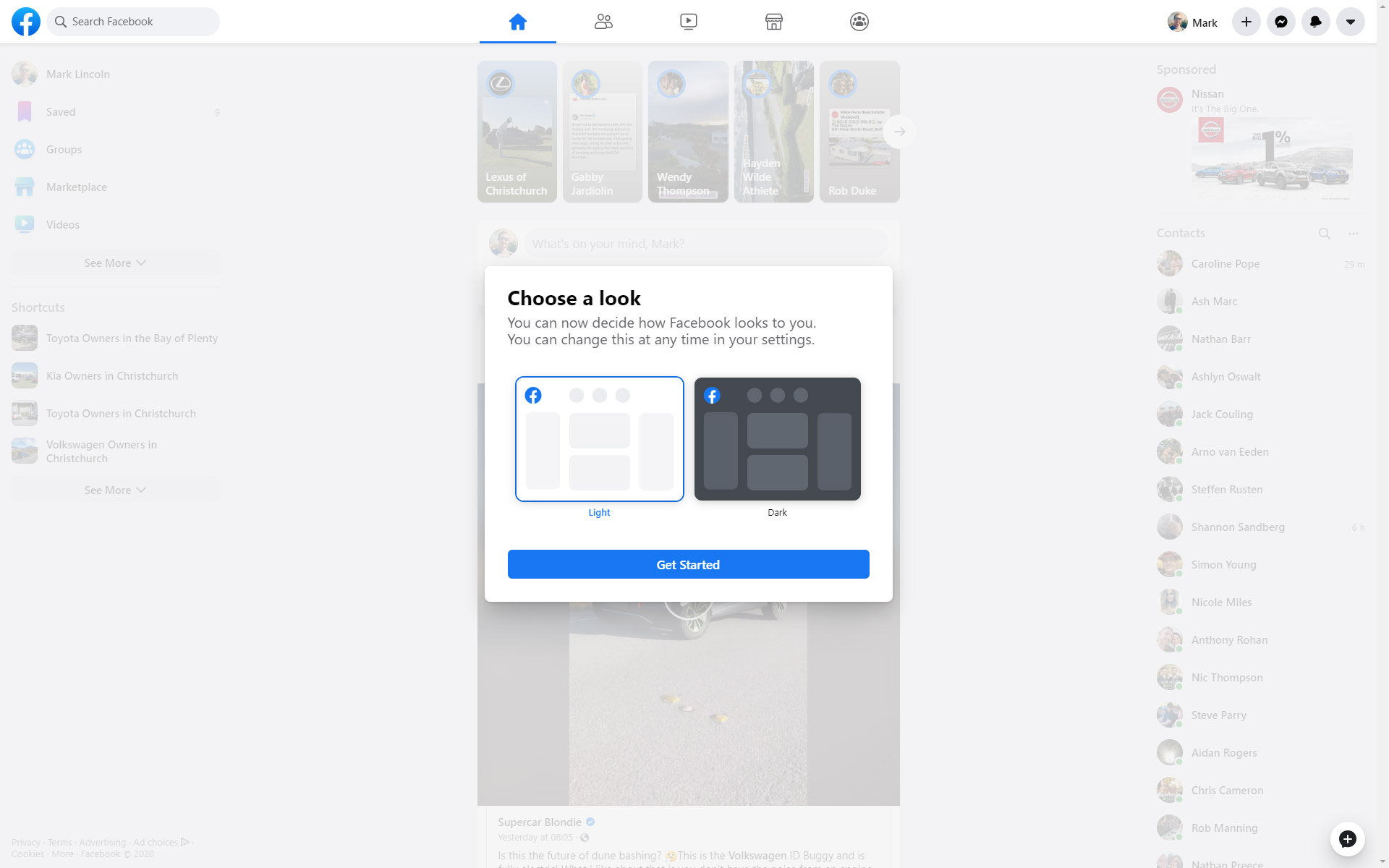
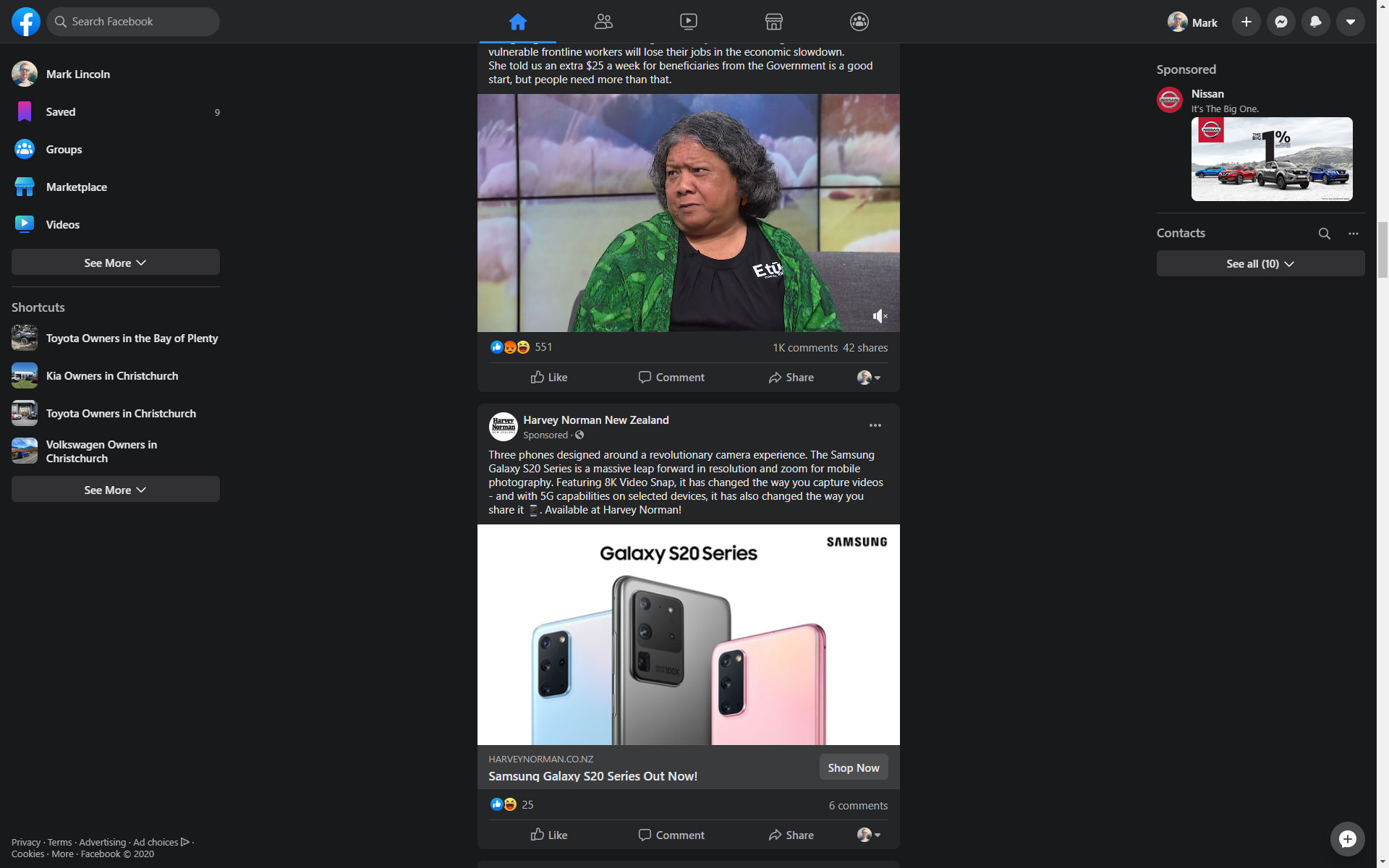
Facebook Now Has Dark Mode
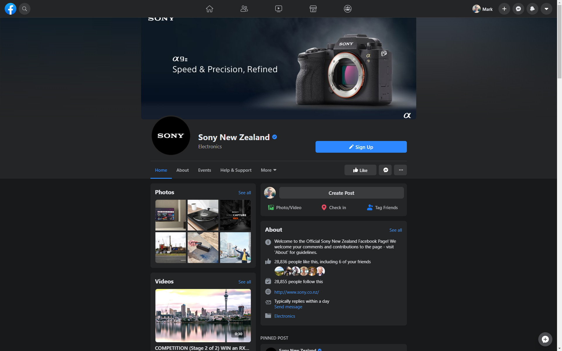
On hitting the go button, the first screen invited me to check out a new dark mode. This is a feature I’ve seen requested by a lot of smartphone users but usually limited to just the smartphone apps themselves. I’m not sure the darkmode works so well on a large monitor in a bright room, with the white text being a little harder to read on a dark background. Not to mention the usual dark coloured borders and dividers being less obvious, making it hard to see where one item ends and another begins.
New Facebook Page Design
The new design appears cleaner with large, symbol buttons, suggesting more of a design made for mobile devices that large monitors. Using a 1920×1200 monitor, the content was pretty spaced out.
The new design has a lot less of the traditional Facebook ‘blue’ colour.
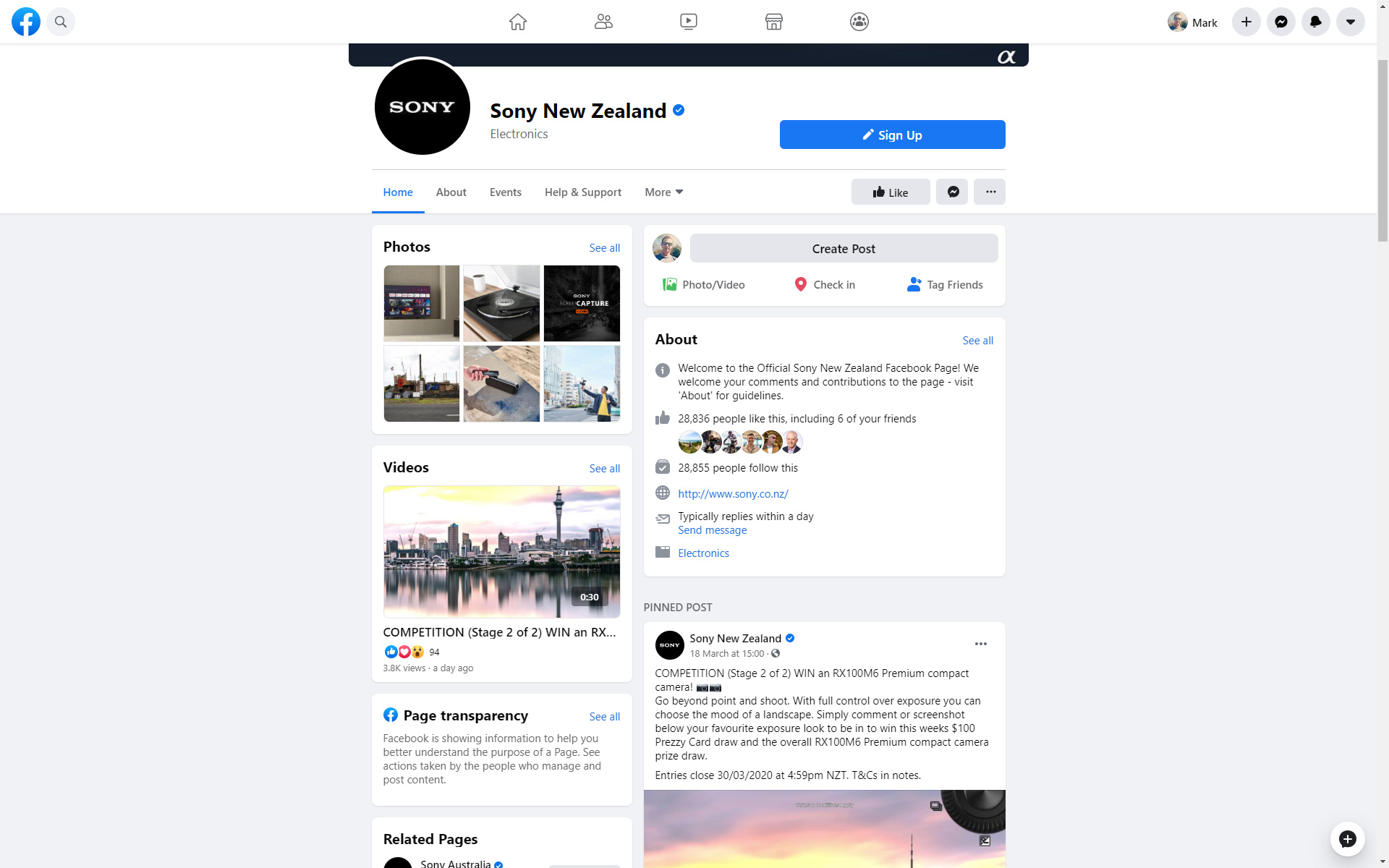
Something I do like is that you no longer have to scroll past large photo and video collections before you get to a Facebook Page’s posts.
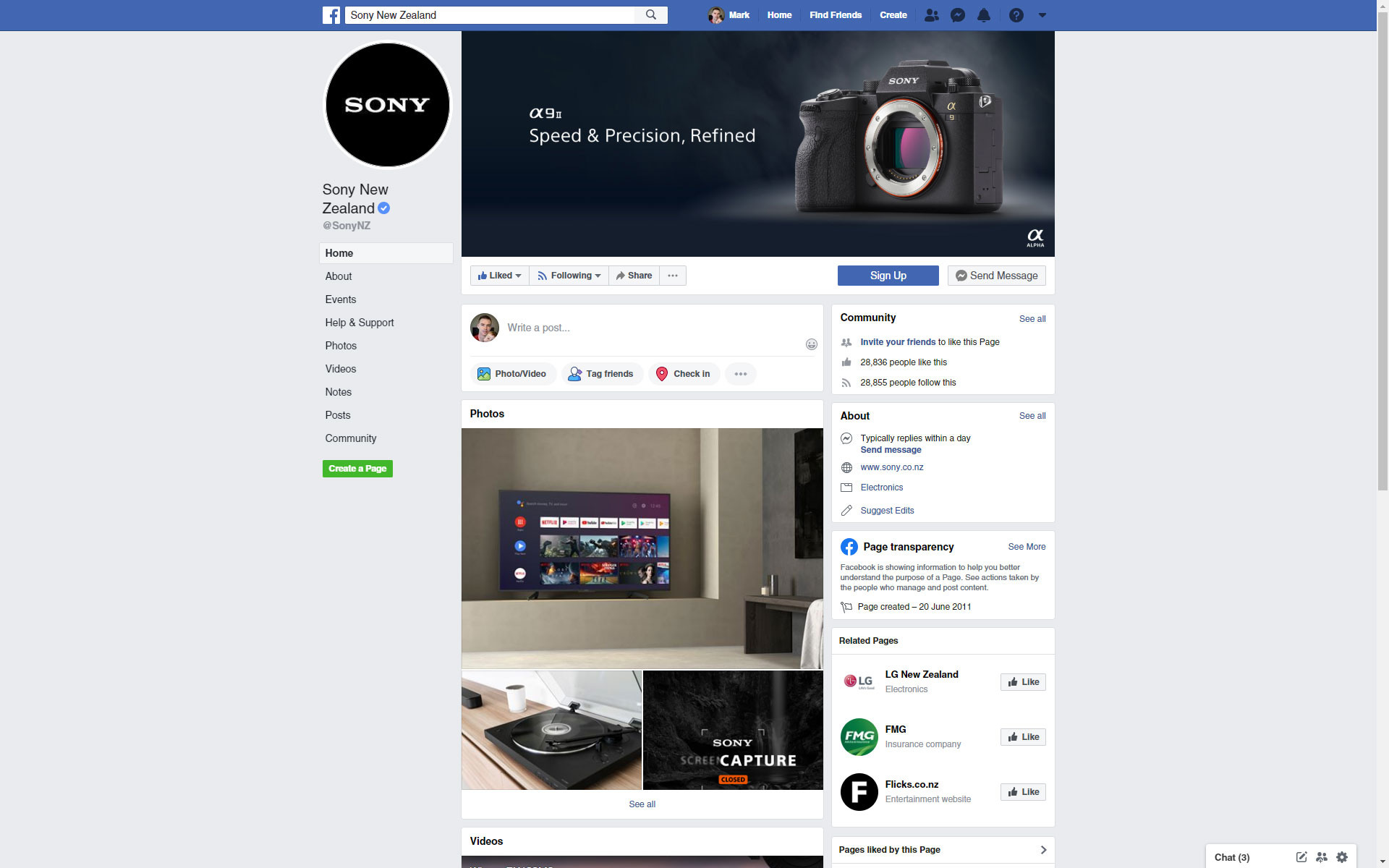
A Facebook Page in the classic format. Three columns and causing you to scroll past large ‘video’ and ‘photo’ boxes before getting to posts.
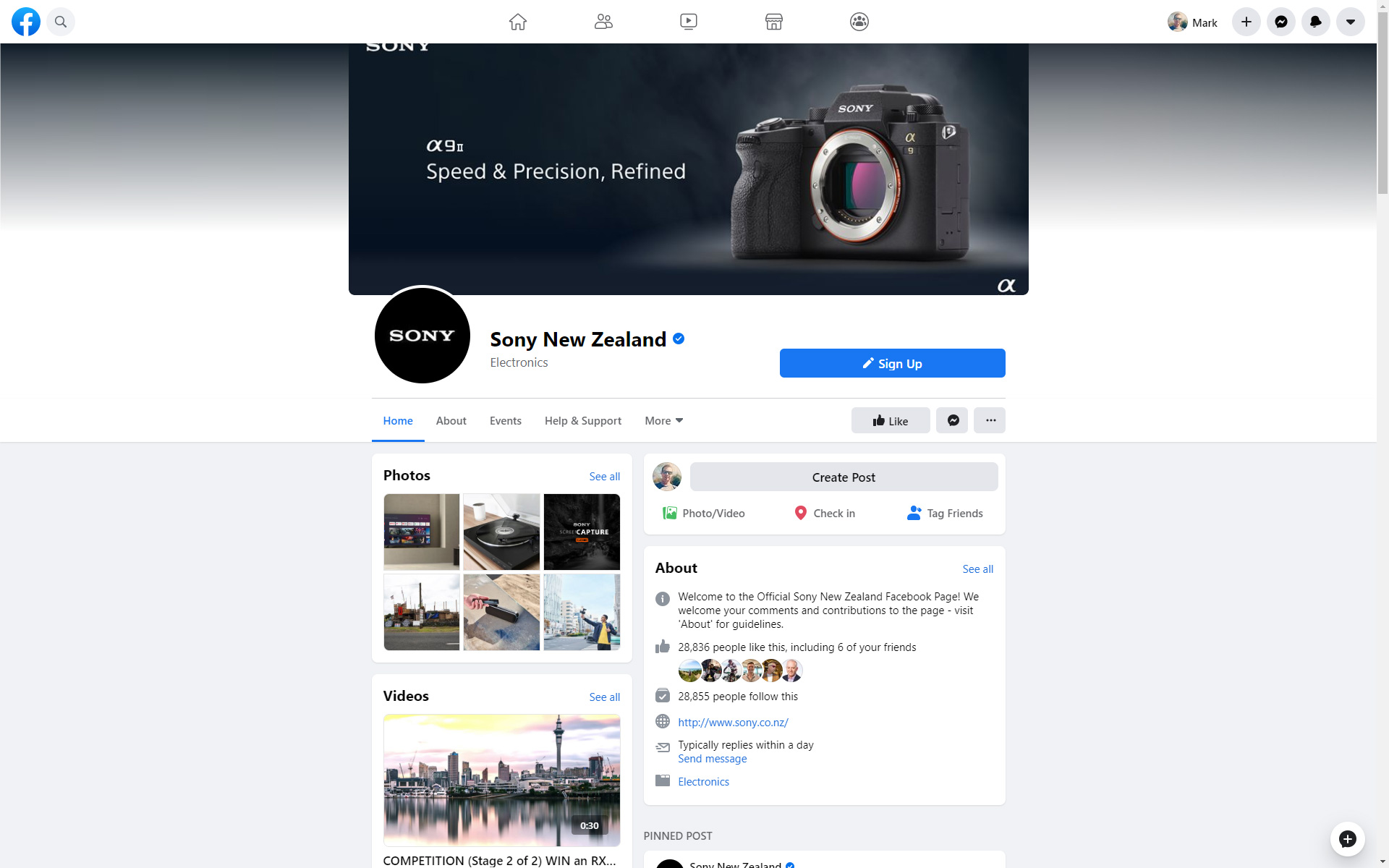
The new Facebook Page design. Two columns, a large information box, and straight into the posts. More space between elements gives a cleaner look.
New Format for Cover Photos
Something worth noting is that on first visiting a Facebook Page as a user, the cover photo is almost entirely cropped. The user needs to scroll up in order to view the photo. The cover photo itself is, however, large at 940×348.14 (thanks Facebook), albeit at maximum size on desktop.
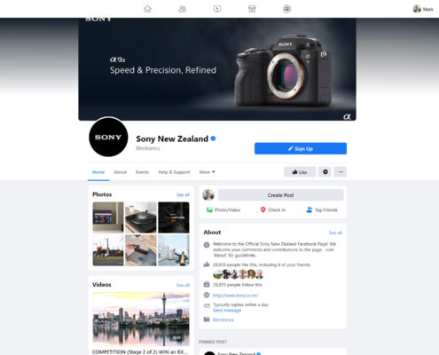
Even when scrolling up, the very top of the image is truncated due to the top-menu overlaying over the image. Example shown above – the Sony text in the top-left corner is cut in half. Sony used an image of dimensions 949×403.
On first visiting a Facebook Page, the cover photo display is minimal.
Scrolling up reveals the full cover photo, except for the very top which is hidden under the top menu bar.
Screenshots of the New Facebook Design
I took a few screenshots of various views. Check them out below.
Facebook Feed in Dark Mode
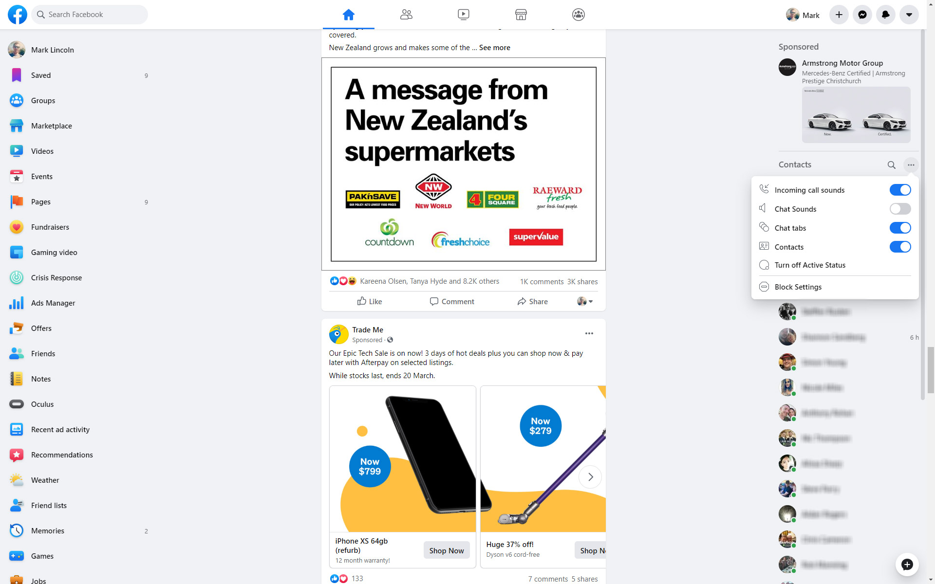
Facebook Feed in Normal Mode
The new Facebook Page design in dark mode.
The new Facebook Page design in normal mode.
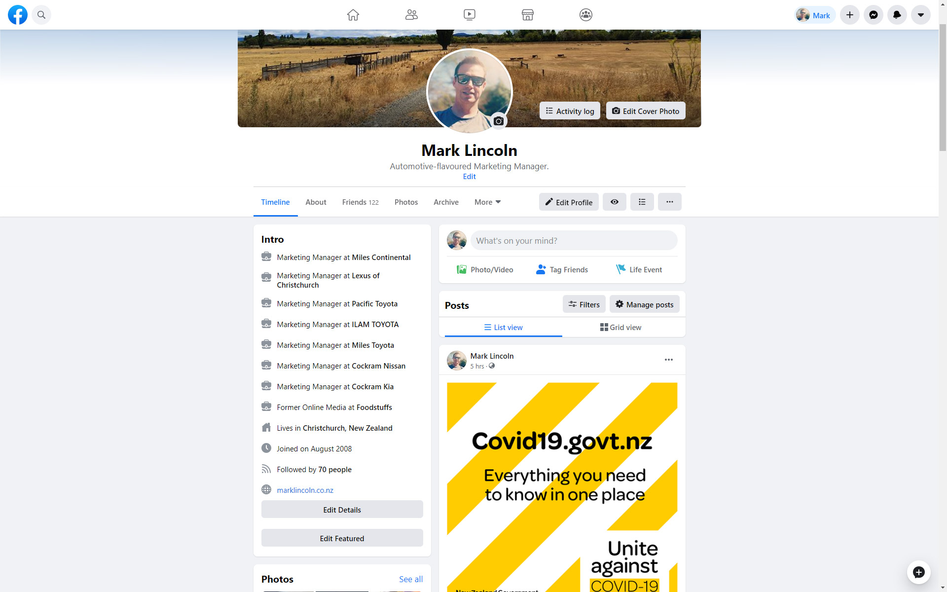
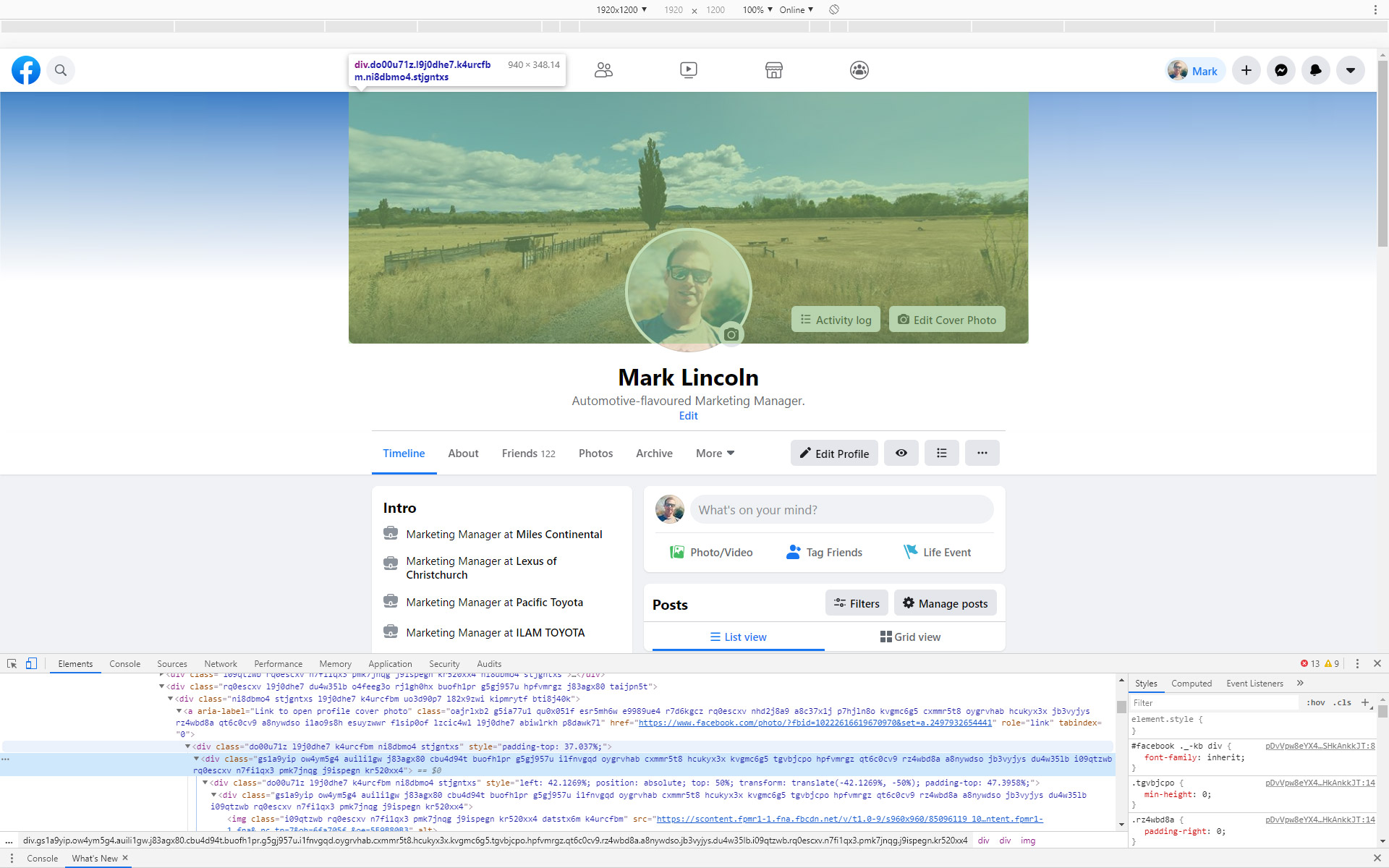
New Facebook Profile design. Profile photo is centralised.
New Facebook Profile design, Scrolled-up with developer view to show cover photo dimensions.
How do I get the new design?
A quick Google shows that the design is rolling out around the world right now. Hold on tight and keep an eye out for a banner showing across the top of your monitor when using Facebook in a desktop browser.







Leave a Reply
Want to join the discussion?Feel free to contribute!